
doorknob, l
(post, Caroline Cummins)
When we decided to rip out our old kitchen and replace it with an entirely new one, my husband and I knew that we'd be spending a lot of money. But we wanted that money to make sense.

So here's a list: the major components of a kitchen (referred to in industry jargon as "finishes"), with the choices we made for each one and why.

We prioritized durability and ease of use, which made some selections pricier (appliances, countertops, faucet) and others less so (flooring, tile, sink). Overall, though, this was a middle-of-the-road kitchen — not budget, not luxe.

h4. Cabinets

Cabinetry is usually the break-the-bank item in any kitchen remodel. Even IKEA's cabinets aren't necessarily cheap. Our contractor originally wrote a bid that included buying and installing IKEA cabinets for about $10,000. But trying to shoehorn IKEA's predetermined boxes into our awkward little kitchen seemed like a headache, so we asked for a bid from a custom cabinetmaker. That cabinetmaker's bid turned out to be only about $2,000 more than the original IKEA bid — for cabinets that were built to fit exactly in our space.

[%image doorknob float=right width=400 caption="A drawer that just barely slides past a doorknob."]

Or rebuilt, as it turned out. In a tiny kitchen, every inch counts, and when the cabinets were first installed, the doorknob on the kitchen door prevented a drawer from opening. So the custom cabinetmaker took apart that entire bank of drawers and rebuilt them to be an inch or two narrower; now that pesky drawer just barely misses the doorknob when opened. Good luck with getting IKEA to do that kind of detail work for you.

We ponied up for wooden cabinets, which are more expensive than, say, the popular MDF (medium-density fiberboard). We chose easy-to-clean flat fronts for the drawers and the almost-as-easy-to-clean Shaker style for the cabinets; both are more affordable styles, since they're easier to fabricate than, say, elaborate carved doors.

We paid more to have the upper cabinets painted white, while the lower cabinets were merely stained. But we wanted a compromise: dark lowers to conceal dirt, and light uppers to make the room feel bigger and brighter. And we paid a little extra to have caned glass installed in the fronts of four of the upper cabinets, so we could see (roughly) which shelves held plates, mugs, bowls, and glasses.

Finally, we bought simple, sturdy, easy-to-grab bar pulls from a local supplier.

h4. Appliances

Like cabinets, appliances can be very, very spendy. But we had churned through a number of budget (Craigslist, anyone?) appliances over the years, and wanted machinery that would last. So we paid a premium — more than $5,000 — for a high-quality dishwasher, vent hood, range, and fridge.

This was a department where hiring a professional contractor helped, since we got the contractor discount at the appliance supplier recommended by our contractor. (In fact, we were given a contractor discount, ranging from 5 to 10 percent, at every local supplier we patronized — a nice perk.) Sales and rebates also brought the total cost down by $2,000 or so.

[%image dishwasher float=right width=400 caption="A dishwasher with hidden controls."]

For the dishwasher, we went for the cleanest look, with the controls hidden inside the door and a streamlined handle that wouldn't bang our hips when we dashed in and out of the kitchen. For the vent hood, we again chose the simplest style, with easy-to-use controls.

The range is a slide-in model, which means all of the controls are on the front. (This is a good thing; it means no more steam burns when you reach across the stovetop to set the oven temperature or the timer.) It has gas burners and an electric oven; we weren't necessarily planning to buy a dual-fuel range, since they're often quite expensive, but this one was on sale.

And the fridge was a very specific purchase: a counter-depth model with French doors and a bottom freezer. We needed the fridge to be counter-depth — i.e., shallower than standard — so it wouldn't stick out into the middle of our little kitchen. We wanted the French doors for the same reason; they don't require as much room to open as a standard single door. And we liked the bottom freezer because we were tired of bending down to hunt for the milk eight times a day — an activity that's even more of a pain when you have a toddler or two in your arms.

We also hate in-the-door ice-and-water dispensers. The water and ice always taste a little off, and they take up too much valuable storage space inside the fridge itself. (Culinate columnist Adam Ried learned this the hard way in his recent kitchen remodel.) But dispensers are popular, and by saying no to them, our choices quickly narrowed to two models. Which was fine; frankly, the fewer the choices, the easier the decision.

h4. Countertops

What to use as a horizontal surface in the kitchen varies from butcher block (cheap) to marble (not cheap). We skipped laminate (too easy to scratch) and tile (too difficult to clean) and the various pretty-but-pricey eco-options (recycled paper, glass, and the like) in favor of engineered stone.

[%image countertop float=right width=400 caption="A countertop made of engineered stone."]

On the higher end of the price scale, engineered stone is basically a slurry of stone chips mixed with a resin and solidified into, well, a solid that looks and feels like granite, but without granite's propensity to crack, chip, and stain. It looks beautiful, but more to the point, it's very, very durable.

h4. Sink and faucet

Our original kitchen came with an enameled cast-iron double-bowl drop-in sink and a flimsy faucet. Over the years, a number of things drove us crazy about this setup. First, the enameling on the sink stained very easily, which meant that the pretty white finish looked dingy nearly all the time. Second, the cast-iron material was the death of many a glass and mug that slipped out of our hands. Third, the double-bowl feature was mostly just wasted space (although it was fun to wash dishes in one bowl while letting our older daughter play with soap bubbles in the other). Fourth, the drop-in design both hogged counter space (with its large lip) and encouraged mildew (with its heavy bead of caulk around the perimeter). And fifth, we had to replace that flimsy faucet at least twice.

[%image faucet float=right width=400 caption="A single-handle faucet."]

So for the remodel, we went low on the sink and high on the faucet — both literally and figuratively. The sink is a heavy-duty single-bowl stainless-steel undermount model; it's deep (a plus for big pots, also for lazy cooks like us who tend to let things pile up in the sink) and thick (16 gauge instead of the standard 18 gauge). Stainless steel is cheaper than pretty much any other kind of sink material, but it's also the most durable and very easy to clean. And the undermount design means we can sweep crumbs directly into the sink; there's no drop-in lip or icky caulk to get in the way.

On our contractor's suggestion, we splurged a bit on the faucet. It's a high-arc model, which means that it has a tall, curving neck. It has a single knob that you just thwok with the side of your hand to turn on (so you don't have to fuss with two twisty knobs) and a pull-down sprayer at the mouth of the faucet (so you can easily spray dishes, vegetables, and the sides of the sink).

The faucet was the only item we purchased online; as our contractor said, faucets are easy enough to pick out in a store and then buy for considerably less online.

h4. Flooring, tiling, and painting

As beautiful and durable as hardwood floors are, we decided early on that we would go for Marmoleum instead. It's cheaper than wood and extremely hard-wearing, plus it gave us a chance to add a bit of color to the room. We chose a pale bluish-greenish color to contrast with the brown lower cabinets.

[%image tile float=right width=400 caption="White tile, brown grout, and yellow paint."]

Backsplashes are another component where it's hard to resist eye-catching designs and colors. Glass! Funky ceramics! Pictures! But our contractor talked us out of it. "Don't do accent tile," he pleaded. "It will date your kitchen very quickly."

The more we looked at backsplash designs, the more we realized he was right. Instead, we went with his recommended plain white subway tile. Not only is subway tile classic, tough, and easy to care for, it's visually restful — a good thing when you're covering much of the available wall space with it. We got a little color contrast via the grout: a medium brown color. (Darker grout doesn't show stains as much as lighter grout.)

Wall paint was the third obvious place to get colorful — or not. Lighter, as our contractor pointed out, is generally better; that festive yellow that looks so good on a tiny sample can be overwhelmingly vivid once it's on the walls. The pale yellow the contractor recommended is just enough to warm up the room.

Weirdly, many of the finishes we chose had food names. Paint? "Icing" (a warm white) on the ceiling and cabinets, and "Butter" (that pale yellow) on the walls. Cabinet stain? "Nutmeg." Countertop? "Truffle." (Beats me, as it's a speckly counter that doesn't look like truffles of either the fungal or the chocolate variety.) And that grout color? "Milk Chocolate." It's as if a bakery picked out all the titles.

h4. Insulation, wiring, plumbing, and lighting

Gutting a room is the no-brainer time to install insulation and upgrade all the ancient wiring and plumbing. Since our house dates to the mid-1920s, these basics consumed the first couple of weeks of the kitchen remodel. But now we have fiberglass batting in the walls and ceiling of the kitchen and wiring (including new retro switchplates) that doesn't fritz and plumbing that doesn't leak. Yes!

[%image reference-image float=right width=400 caption="A pendant light by a window."]

As for the lighting, we upgraded the undercounter lights from dim fluorescents to long-lasting LEDs. And we added two pendant lights, one in front of each window, so we would be able to see what we were doing at the sink and by the stove. The kitchen is in the northeast corner of the house, so it's generally a dark space. Now, however, we can blast 100-watt light from multiple locations.

All of which makes the kitchen by far the coziest, best-functioning, and well-lit room in the house. Too bad there's no room for an armchair next to the heating vent.
doorknob, l
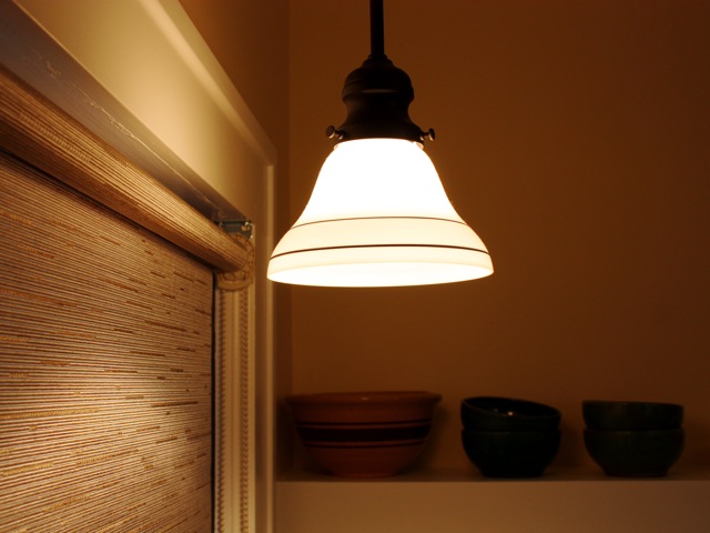
reference-image, l
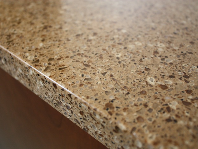
countertop, l

dishwasher, l

faucet, l

tile, l